Did you know that mobile is now the primary channel on which consumers read marketing emails (according to research published in ‘Marketing Week’)?
It’s not surprising really when you consider that around 81% of adults in the UK own a smartphone, spending on average around 2 hours a day on it.
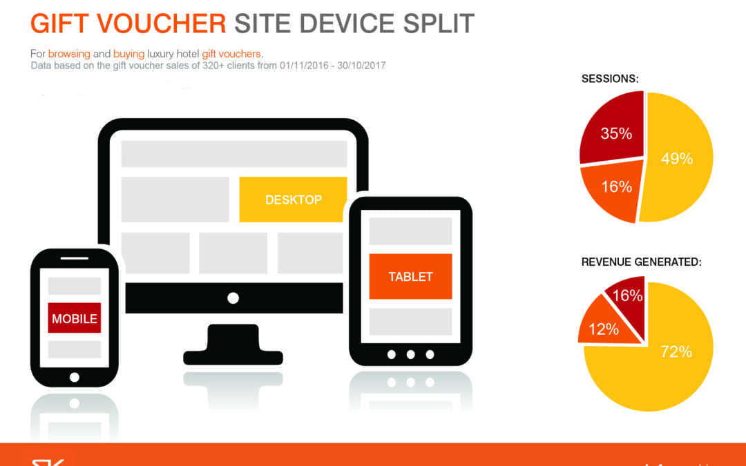
We looked at the browsing and buying of luxury hotel gift vouchers, exploring the data of over 320 of our clients and ‘mobile’ accounted for 51% of all visits to the venues’ gift voucher sites and accounted for just 25% of revenue generated. Whereas desktop accounted for 49% of all sessions and 71% of revenue generated.
Given that 70%+ of email engagement is happening on mobile devices, what can you do to approach your email content differently and optimise your gift voucher email campaigns for mobile devices, to help engage and ultimately sell more gift vouchers to your mobile audience?
1. Use a responsive design template for your emails
Your own website may be mobile friendly, and your gift voucher site is, but are your emails? Have a look at one of your own marketing emails via your smartphone – is it responsive, or are your customers still needing to pinch to zoom in to read content on your email via their mobile device? Make things easy for your customers by ensuring your emails are easy to read on your pocket sized design.
2. Consider the ‘read’ time
People’s attention span can be limited; they tend to read in shorter bursts on mobile, with a high proportion of people glancing at emails for 3 seconds or less before moving on. In addition to this, you don’t have a lot of space to work with on a mobile screen, so keep your message clear and concise, with a vibrant image and an unmissable call to action!
3. Prominent ‘call to action’ button
Ensure the ‘call to action’ button on your email is noticeable and doesn’t blend in or match with other buttons. Fingers are much less precise than pointers, so need bigger targets to click on, especially those connected to sales. And take care with your ‘call to action’s position in your email – avoid forcing you readers to scroll down more than necessary.
4. Consider your ‘post click’ experience
Does your ‘call to action’ button take the user directly to your gift voucher site or a specific gift voucher or gift category in your email? By doing this, your customers can click through directly to what you are promoting and go on to purchase with ease via your mobile friendly gift site, making their experience as frictionless as possible.
5. Track – tweak – repeat
You and your customers are unique! Be data driven and willing to test different styles, timings and wordings to understand your customers’ behaviour and increase mobile conversions. Only by measuring the impact of your emails can you find out what works best for your venue and your customers.
In conclusion
The digital world is exciting and constantly evolving! What is very clear is that mobiles are a staple of everyday living now with huge numbers of people browsing and buying through their smartphones. Little changes that you make now to enhance your customers’ experience could make a big difference in promoting your brand, engaging customers when they are ‘mobile’ and ultimately selling more gift vouchers.
