
If you own a smartphone the chances are you’ve been on Google and made a search. How annoying is it when you click on a result and your chosen website takes some time to load? According to Kissmetrics frustration leads to abandonment for many of us after only 6 seconds – these days we expect a website to load in 2 seconds or less. More annoyance sets in when the page eventually loads and you need to squint (certainly in my case!) and pinch to zoom in to read content or tap the screen to make a desired action.
Back in April this year Google added a ‘mobile-friendly’ ranking factor to the way it calculates website relevance for users searching on their mobile. Ultimately the aim is to show more mobile-friendly relevant websites in place of websites deemed less mobile-friendly. The change is only intended to affect mobile search results – desktop computer search results are unaffected.
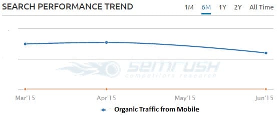
Now that this change is fully rolled out we are starting to see ranking positions take a slight drop for websites that have yet to be made mobile-friendly. For example the SEMRush Organic Traffic performance chart below shows a downward trend in mobile traffic over the past month for a website awaiting re-development work to make mobile-friendly:
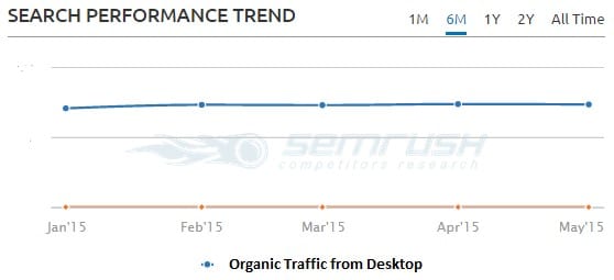
Whilst organic perfomance from desktop for the same website remains consistent:
For many this change in the mobile search results is welcome. Now more than ever mobile-optimised content is not optional. Google states that its algorithms need to adapt to new usage patterns and mobile has transformed how we consume digital content over the last 2 – 3 years. Here at the 80Days HQ we see Mobile sessions now making up 25 – 30% of all traffic to client websites. Conversions via mobile are also significant and growing.
So how mobile-friendly is your favourite website?
Aside from conducting your own user-testing, one quick way to gauge this is to add your website to Google’s test tool here:

If your website is not deemed mobile-friendly you’ll see a short report similar to below:
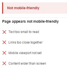
On seeing the above report you get some idea of what Google looks at to determine and categorise a website as ‘Not mobile-friendly’. Google’s notes the main factors for friendliness on its website:
“Now searchers can more easily find high-quality and relevant results where text is readable without tapping or zooming, tap targets are spaced appropriately, and the page avoids unplayable content or horizontal scrolling”.
As well as above test it is also worth checking mobile page load speed. To help with this Google has a PageSpeed Insights tool. This will make a number of checks and provide recommendations such as ensuring website images are size optimised for fast download.
Options for a mobile friendly website…
So what are the options for a mobile-friendly website? Essentially if we discount building a dedicated mobile app, there are 3. All will require website development work to properly implement:
1. Responsive Design
This is the most favourable option in our opinion as it can benefit both customers and search engines. With responsive design the website URLs are consistent and the content is configured to resize with full functionality across all devices i.e. desktop, mobile and tablet. There is also the advantage of having only the one website to maintain. The main drawback with this option is that is highly probable the original desktop website will require a full re-design.
2. Dynamic Serving
With dynamic serving the main advantage is that website content can be restyled and tailored to be more mobile specific using the same URLs as used for desktop – so this option properly configured, is also search engine friendly. The main disadvantage is that this configuration can incur additional development time and so be more expensive to maintain.
3. Separate Mobile site
The remaining option is to set up a separate M-dot mobile site such as m.mywesbite.com. Generally as viable solution this type of solution is on the decline and we would only recommend this where there are specific mobile objectives for the business.
The advantage with this option is that content can be streamlined making it more focused on particular mobile-user goals. The main disadvantages are the maintenance overhead of running 2 websites and the fairly complicated setup required to ensure a search engine friendly configuration. Device checking redirects need deployed which can introduce delays and important ‘alternate’ and ‘canonical’ tags need added to pages to help search engine properly index and avoid duplication.
In conclusion
The change Google made to mobile results in April didn’t have the immediate ‘Mobilegeddon’ traffic loss upset that was widely predicted across the search industry, but now fully rolled out we are starting to see the effects.
If your company website is not compatible with mobile devices it will be hampering a significant percentage of your website visitors. It is also likely to drop out for more competitive searches on mobile search result pages.
It is now more important than ever to ensure mobile-friendly is No1 priority on any new website requirements list.
About the Author
Murdoch MacRury is passionate about all things Search, and has worked in the field of Internet Marketing for over a decade. As the Head of Digital Marketing at Occupancy Marketing, specialists in the Luxury Travel industry, Murdoch and his team work to increase the direct bookings and reduce OTA commissions of their clients. For more information about Occupancy Marketing, please visit www.occupancymarketing.com